
The system in one sentence
Family Express pages are built like a well-kept store: flat fields of color for each section, softened shapes for everything you touch, a single ink line for every edge, and motion that answers quickly and lands softly.
Principles
Flat and bright. Sections are flat fields of color. There are no gradients, no shadows and no glass effects; a change of color is what separates one block from the next.
Soft corners, never pills. Every shape has rounded corners, but buttons and chips are softened rectangles, not round-ended pills. Bigger things get bigger radii: a button, a field, a card, a photo.
One line. Edges are drawn with a 1px line in ink, the same color as the text. Nothing floats on a shadow.
Quick and soft. Motion responds fast and settles with a long, gentle landing. It confirms what happened and gives the page some life as it scrolls; it never delays a task.
Shapes
The interface speaks with six shapes, each tied to a radius token in the site’s code. Roles are not swapped: a button always has button corners, a photo always has media corners.
rounded-buttonEvery CTA and chip: a softened rectangle.rounded-fieldInputs, selects, search bars and small tiles.rounded-panelCards, dialogs, sheets and grouped content.
rounded-mediaPhoto frames and the footer card.rounded-fullIcon buttons, and the hairline ring around a pictogram.rounded-[50%]A horizontal ellipse that frames a pictogram in feature columns.The radius grows with the size of the element, so corners look the same at every scale. Full circles are reserved for icon buttons and for the hairline ring around a pictogram. The arch, a photo with a fully rounded top, belongs to the promotional Home hero only.
Surfaces and layering
 Night scrim Behind light text on a photo, rising from the foot of the frame.
- Paper is the page. Content sits straight on it, separated by space and hairlines.
- Surface is the workhorse field: most sections and the tiles inside them sit on it.
- Pastel gives a lighter, brighter band when a page needs a change of pace.
- Aqua is the bright, color-blocked moment: the Home statement, a highlighted comparison, a featured band. One per page.
- Night gives a page its weight: a feature band, the mobile menu, and the footer, which sits as a rounded night card inside the paper page.
- Scrims sit between a photo and light text on it: a night gradient rising from the foot of the photo, the one gradient in the system.
Line and elevation
The system is flat. Borders are 1px lines in ink on light fields, in pastel on night; they draw cards, fields, chips, panels and dividers. Long lists, such as the store chooser, use the softer line color. Nothing has a drop shadow: a dialog or a menu is separated from the page by its own field and a night scrim behind it, not by elevation.
Motifs
The softened button. Every action is a softened rectangle with 14 px corners, in red for the primary action, ink, pastel or outlined for the rest. With its rolling label on hover, it is the most recognizable element of the interface after the logo.
The hairline ring. A 1px circle or oval in the text color holds a pictogram on cards, benefits and topics. It keeps icons from floating on their own without adding a fill.
The icon pill. In a large statement, each offer is introduced by a small pill with its icon, set inline with the words: food and drink, car wash, fuel and fleet, F.E. Perks.
The arrow. Links end with an arrow that tells where they go: right for a page of the site, up-right for another site.
Image treatment
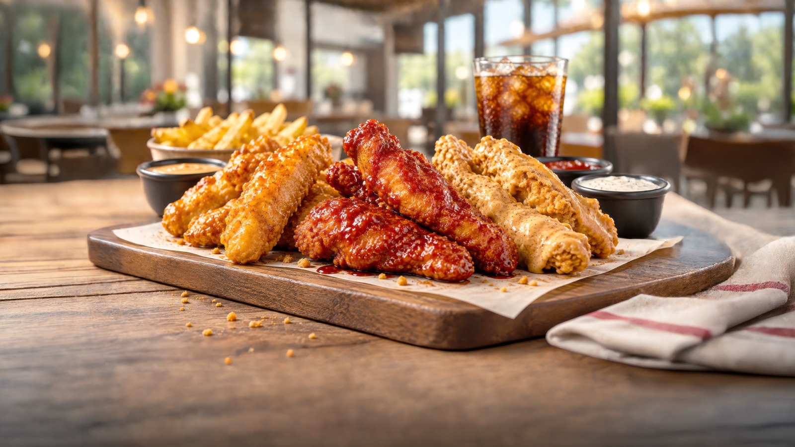
Photos sit in a frame with 32 px media corners, cropped to fill it edge to edge and never letterboxed. The exceptions are the Home hero, whose photo runs to the edge of its half of the screen, and the arch of the promotional hero. When light text sits on a photo, a night scrim rises from the foot of the frame. Captions, when needed, sit below the image in caption type, never on top of it.
On scroll, a photo frame scales in gently from 94% as it enters the screen, and the image inside it moves a little slower than the page, a light parallax that gives depth. Photos are delivered clean: the site adds no texture, filter or tint over them.
Layout and grid
- Container
- Max 1760 px, centered Fluid side gutter from 16 px on phones to 90 px on desktop.
- Grid
- 12 columns from 768 px Gap from 16 to 24 px. One column on phones.
- Section
- 56 to 72 px top and bottom 40 px on phones. Compact sections: 40 to 48 px.
- Stack
- 32 to 40 px From a section heading to its content.
- Reading measure
- 40 rem Body copy never runs wider than about 640 px.
- Breakpoints
- 768 · 1024 · 1280 px Layouts change at 768 and 1024; the full desktop navigation appears at 1280.
Content lives in one centered container with gutters that grow with the screen. Sections are full-width fields with fluid vertical padding; inside, a 12-column grid from 768 px organizes text and media, and long reading text keeps to a narrower measure. On tablets, rows that hold display type stay stacked until 1024 px, so headlines never squeeze into a narrow column.
Phones. Main actions, such as a form’s submit, Continue and Back, or a section’s main CTA, span the full width of the container, stacked with the primary action first.
Motion
--ease-out-quart Hovers, menus, sheets and most state changes. --ease-in-out-quart Movements that start and stop on screen, such as the slider. --ease-out-expo Scroll entrances: a fast start and a long, soft landing. - Fast
- 180 ms Color and underline changes.
- Base
- 360 ms Button fills, rolling labels, chevrons.
- Slow
- 640 ms Panels, the mobile menu, larger moves.
- Reveal
- 900 / 1100 ms Fade and rise as sections enter.
- Reveal. Sections fade and rise 48 px once as they enter the screen, over 900 to 1100 ms on the expo curve, with elements that enter together slightly staggered. Photo frames scale in instead of rising.
- Hover. Buttons raise a fill from the bottom while the label rolls; links fade in their underline; chevrons turn.
- Hero. On first load the Home hero opens its photo from the bottom and brings its headline in word by word, then the copy, the buttons and the slider tabs. Slides change with a wipe.
- Menus and sheets. The mobile menu, mega-menus and bottom sheets slide and fade on the quart curves; accordions grow their height so the rows below glide.
- Smooth scroll softens wheel and trackpad scrolling on desktop; touch keeps native scrolling.
- Reduced motion. When a visitor asks their system for reduced motion, reveals, parallax, the hero intro and smooth scrolling are off, every duration drops to zero, and content simply appears.
Putting it together
Three compositions built only with the elements in this book: the logo, the palette, Lilita One and Hanken Grotesk, the icon set, the photography and the shapes and fields above. The copy is Family Express’s own.
New Saucy Tenders. Three bold flavors.
Order now
Everything Family Express in one place: food & drink, car wash, fuel & fleet and F.E. Perks.
Order foodF.E. Perks
Earn points on food, in-store purchases and fuel.
- 1Download & join
- 2Earn everywhere