
When to use
Navigation is the frame every page shares: the header on top, the footer at the end and, on child pages, a breadcrumb under the header. The labels, their order and their destinations come from one file in the site (data/navigation.ts), which feeds the header, the phone menu, the footer, the sitemap and the link tests, so they never drift apart.
The primary navigation has five items, in this order: Food & Drink, Locations, F.E. Perks, Car Wash, Fuel & Fleet. The utility band holds Find a Store, About Us, For Business, Careers, Press and Help. ORDER FOOD is the one red action and is always in the header.
Anatomy
| Part | Rule |
|---|---|
| Utility band | 40 px, sky with night text, a 1px ink line under it. Caption size (14 px on desktop), 28 px between links. Find a Store sits alone at the left with a 14 px pin; the rest align right. |
| Main bar | 80 px from 1024 px (64 px below), paper, a 1px ink line under it. Logo, links and action spread across the container. |
| Logo | 56 px tall from 1024 px, 44 px below. A link to the Home named Family Express home. |
| Primary links | UI size (17 px on desktop, weight 500), 24 px apart (36 px from 1536 px), each at least 44 px tall. |
| Mega-menu chevron | Food & Drink and Car Wash carry a 16 px chevron in its own 32 px button, right after the label. The label stays a link to the section page. |
| ORDER FOOD | The red button, 48 px tall with 32 px side padding from 1024 px; 44 px below. Paper label, rolling-label hover. |
The header is sticky. On desktop, scrolling down more than 120 px slides it up by the utility band’s height so only the main bar stays; scrolling up brings the band back, and so does moving keyboard focus into it. The Custom Printed Cookies flow is the one exception: there the whole header slides away on scroll, at every size (Custom Printed Cookies flow).
Header on phones and tablets
The full desktop header starts at 1280 px: six utility links, five primary links and ORDER FOOD do not fit cleanly below it. Under 1280 px the utility band is gone and the bar is 64 px (80 px from 1024 px).
Food & Drink mega-menu
-
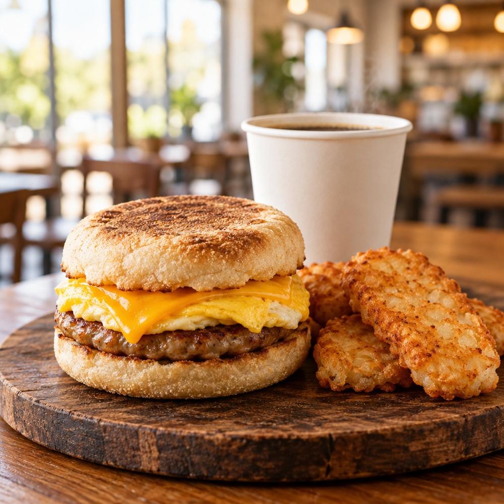 Breakfast
-
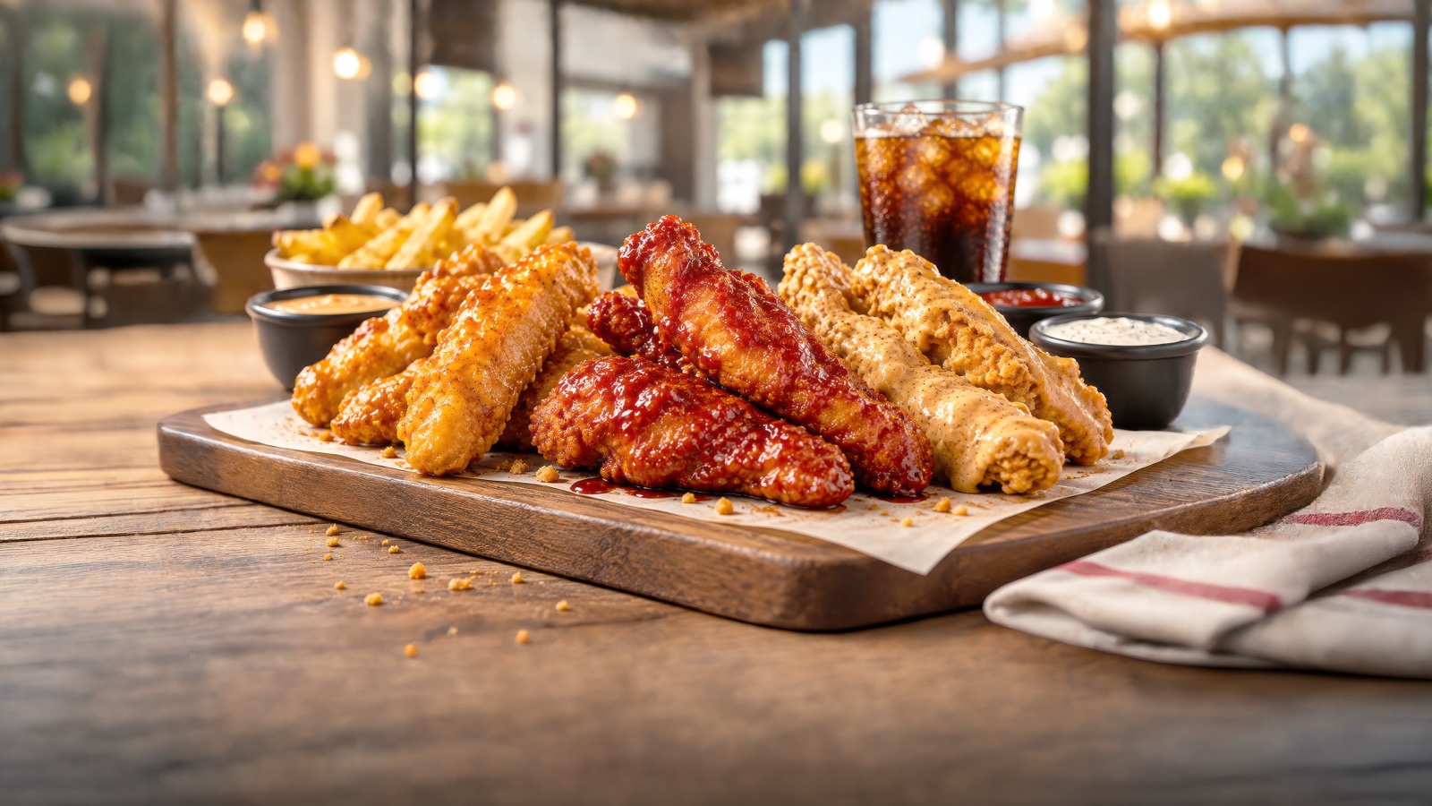 Chicken
-
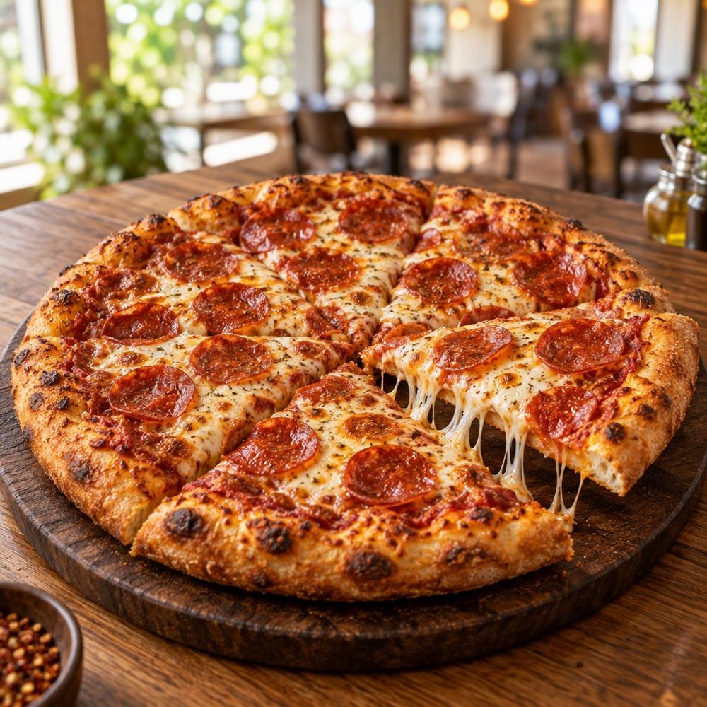 Pizza
-
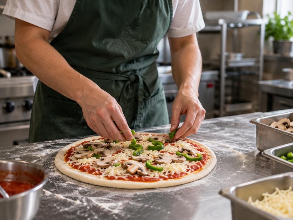 Sandwiches
-
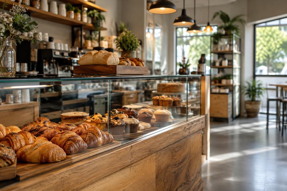 Snacks
-
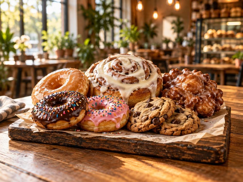 Cravin's Bakery
-
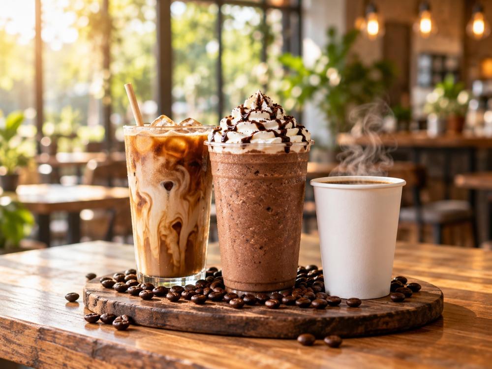 Coffee & Frozen Drinks
-
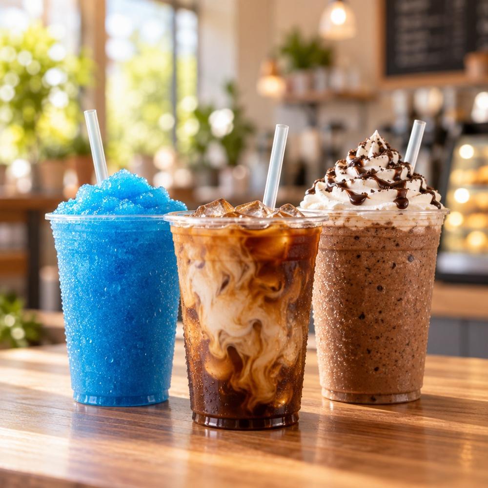 Beverages by the Case
- Custom Cookies
New Saucy Tenders Family Express Kitchen · $4.49
Order Car Wash mega-menu
-
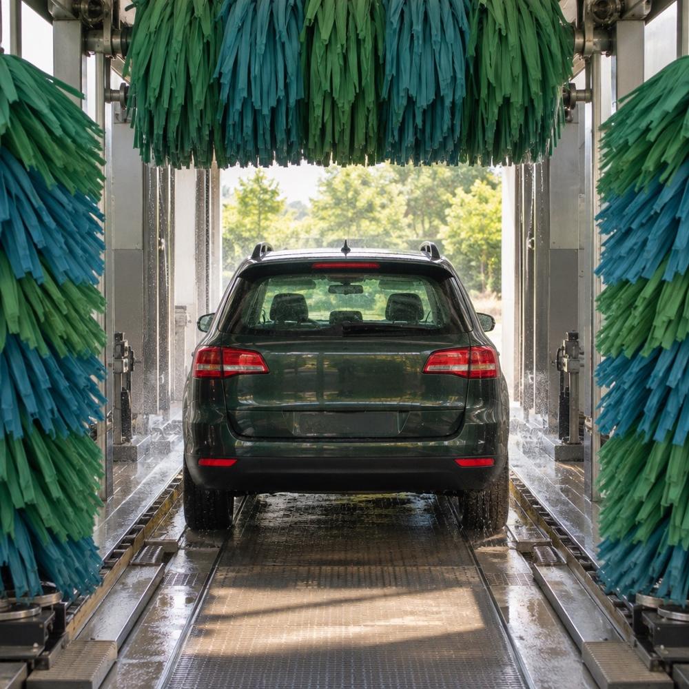 Express washes
-
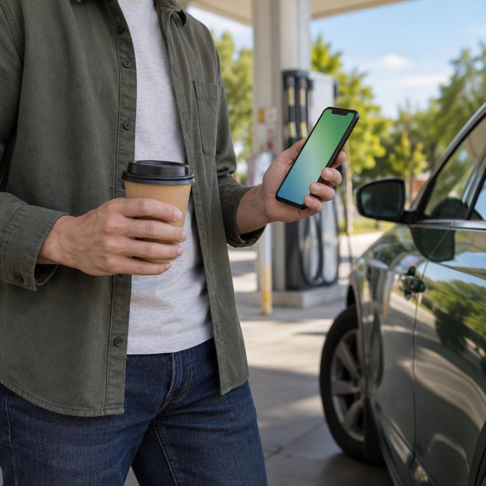 Unlimited Club
-
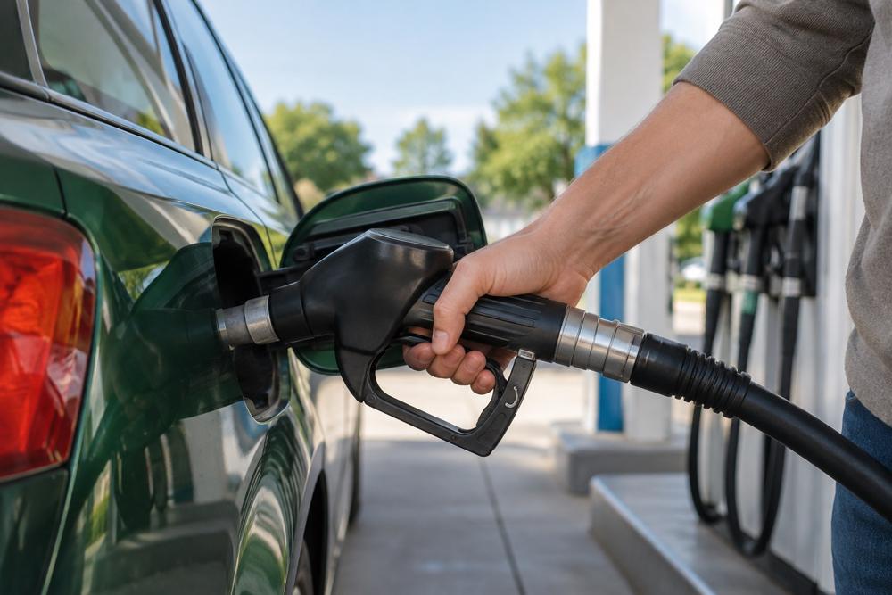 Portage Car Wash
-
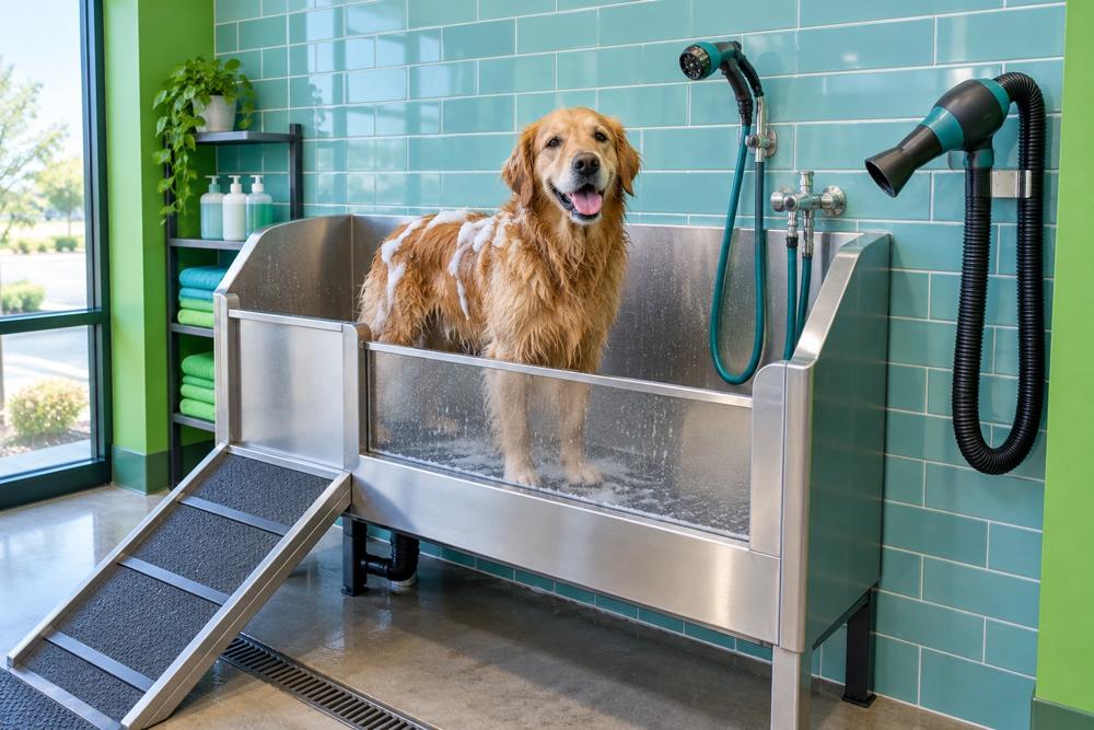 Pet Wash
| Part | Rule |
|---|---|
| Panel | Full header width under the main bar, paper with a 1px ink line under it. The content sits on the 12-column grid, 40 px from the top and 48 px from the bar. |
| Group heading | Eyebrow (14 px, weight 600, 0.08 em tracking, capitals). A text link with an arrow can sit at its right: What are you craving?, Car Wash overview. |
| Category tile | Food & Drink: five per row, square photo with 16 px corners, the name at caption size weight 600, centered. The photo scales up slightly on hover and the name underlines. |
| Wash card | Car Wash: four per row, 4:3 photo with 16 px corners, the name at UI size weight 600 and one caption line under it. |
| Link list | Our brands and Quick links: UI size, each row 44 px. |
| Bar | Surface with a 1px ink line on top, at least 72 px: a text link at the left, the section’s action at the right. |
| Scrim | Night at 50 % over the page below. Pointing at it or clicking it closes the menu. |
The panel opens on hover after 120 ms and closes 220 ms after the pointer leaves, so it does not flash as the pointer passes. The chevron button opens it for keyboard and touch. It fades in and moves down 8 px over 400 ms; Escape, a click outside, leaving the item or choosing a link closes it.
The Quick links add Car Wash FAQ only while the FAQ has questions.
Phone menu
| Part | Rule |
|---|---|
| Panel | Night with pastel text, from under the 64 px header to the bottom of the screen. Scrolls on its own only when even the 56 px rows do not fit, as in landscape. |
| Primary row | Display M (30 px on a phone), a 1px pastel line at 20 % under it. Plain rows are links; Food & Drink and Car Wash are buttons with a 20 px plus. |
| Accordion | One open at a time. Its links are UI size, 44 px each, in two columns 16 px apart. Food & Drink lists the categories, Custom Cookies and Our brands; Car Wash lists the overview, the four wash options, Find a car wash and Get the app. |
| Utility links | Under the rows, 32 px down, in two columns 24 px apart. |
| Social | A 20 % pastel line, then the four marks, 22 px in 44 px targets. |
On opening, the panel fades in over 300 ms, each row’s label rises out of a mask and its hairline draws in from the left, 60 ms after the one above; the utility links and social marks settle last. An accordion grows its height over 600 ms so the rows below glide instead of jumping; under reduced motion it opens instantly. Escape, choosing a link, a page change or widening the window to 1280 px closes the menu.
Footer
| Part | Rule |
|---|---|
| Card | Night, 32 px corners, pastel text. 64 px side padding from 1024 px (48 px from 768 px, 24 px on phones), 80 px on top (56 px on phones). |
| Logo | 64 px tall, a link to the Home. Three columns of the grid on desktop. |
| Columns | Food & Drink, Services, Company, Support. The title in eyebrow at 80 % opacity, the links at UI size, 44 px each, underlined on hover. Links to other sites end with a 14 px up-right arrow and open in a new tab. |
| Bar | 64 px under the columns, a 30 % pastel line, then the copyright and the three legal links at caption size (always underlined) at the left and the social marks at the right. |
Breadcrumb
The breadcrumb opens the hero of the inner pages, section pages such as Car Wash and F.E. Perks included, at caption size with an 8 px gap around each slash. The Home has none.
Custom Printed Cookies flow
Ordering custom cookies takes five steps: Pickup, Design, Customize, Quantity and Checkout. The order pages and the confirmation keep the site header and the footer like every other page, and add a flow header: a paper strip right under the site header that says where the person is in the order and where it will be picked up. The logo stays in the site header, so the strip has none, and there is no Save & exit: the order is kept for the session, and the site header is always one scroll up.
- Pickup
- Design
- 3 Customize
- 4 Quantity
- 5 Checkout
- Pickup
- Design
- Customize
- Quantity
- Checkout
| Part | Rule |
|---|---|
| Strip | Paper, a 1px ink line under it, on the container’s gutters. 16 px top and bottom on desktop. |
| Title | Custom Printed Cookies in UI type (17 px, weight 500). It is the page’s h1 while the order is in progress. |
| Pickup chip | 36 px tall, 1px ink border, 14 px corners, a 16 px pin, then store · date in caption type (Store 001 · Sat, Nov 22). It appears as soon as a store and a date are chosen. On desktop the chip is a button that reopens the Pickup step and fills pastel on hover; on phones an Edit text link beside it does that job. |
| Steps (desktop) | A 28 px circle with the number in caption type, then the label, 16 px apart. Done and current circles fill ink with paper text, and a done step shows a 14 px check instead of its number. The current label steps up to UI type. |
| Back (phones) | A 44 px hairline circle with a 16 px left arrow: back to the previous step, or out of the flow from Pickup. |
| Progress (phones) | Step 3 of 5 · Customize as an eyebrow and Quantity next in caption type, then five 4 px segments, 4 px apart: ink up to the current step, line after it. |
On scroll
Only in this flow, the flow header is sticky right below the site header, and scrolling down more than 120 px hides the whole site header, at every size, so the strip rises to the top of the screen and keeps the step in view. Scrolling up by more than 6 px, or moving keyboard focus into the header, brings it back, and the strip returns under it. Both slide over 360 ms on the out-quart curve; with reduced motion they move instantly. Everywhere else the header never leaves: only its utility band slides away, on desktop.
The strip publishes its own height, so the sticky summary cards and anything scrolled to or focused stop clear of both bars instead of hiding under them.
Action bar
On phones and tablets, below 1024 px, every step ends with a fixed bar at the foot of the screen: paper, a 1px ink line on top, the summary of the step (the pickup time, the chosen design with its thumbnail, the design and its contents, or the cookie count and total), a way back and the step’s primary action.
- Primary action: 44 px tall, 14 px corners, UI type. Full width on phones, sized to its label from 640 px. Ink with a red hover on every step, except Add to cart on Quantity, which is red with an ink hover. It stays at 40% opacity, disabled, until the step is complete.
- Back: an underlined caption link on phones (Designs, Customize, Change), a 44 px hairline button from 640 px. On Pickup the bar has no back: the button in the flow header leaves the flow.
- Room for it: while the bar shows, the page reserves its height at the bottom, so the footer ends above it and keyboard focus never lands under it.
From 1024 px there is no fixed bar. Each step carries its primary action and its back link inside its own summary card, next to the choices they confirm.
States
A section stays current on its child pages too: the Car Wash link is underlined on Pet Wash and Portage Car Wash, Fuel & Fleet on the Fleet Card page.
Sizes
| Element | Phones and tablets | From 1024 px | From 1280 px |
|---|---|---|---|
| Utility band | none | none | 40 px |
| Main bar | 64 px | 80 px | 80 px |
| Logo | 44 px tall | 56 px tall | 56 px tall |
| ORDER FOOD | 44 px, 20 px sides on phones, 24 px from 640 px | 48 px, 32 px sides | 48 px, 32 px sides |
| Links | in the menu | in the menu | in the bar |
The container’s side padding grows with the screen, from 16 px at 375 px to 90 px at 1440 px, so the header, the mega-menu panel and the footer always line up with the page content.
Usage
- Pickup
- 2 Design
- 3 Customize
- 4 Quantity
- 5 Checkout
 Step 2 of 5Save & exit
- Flows keep the frame. A multi-step task such as the cookie order sits inside the site header and footer, with its own strip under the header. The strip, not a second header, carries the steps.
- Labels come from the navigation data. Header, menu and footer read the same list; a label is changed there, never in one place only.
- No top-level additions. New pages hang under an existing section and get a breadcrumb; they are reached from that section’s page, its mega-menu or the footer.
- No dead links. Every link resolves to a page; nothing points to
#. - The mega-menus mirror the phone menu. Food & Drink and Car Wash list the same destinations in both, so phones lose nothing.
Accessibility
- Each navigation is a named landmark: Utility and Primary in the header, Menu in the phone menu, Footer and Legal in the footer, Breadcrumb on inner pages. A skip link comes before the header.
- The current section carries
aria-current="page", not only its underline. - Each mega-menu chevron is a disclosure button with its own name (Food & Drink menu) and
aria-expanded; Escape closes the panel and returns focus to it. - The phone menu toggle is named Menu or Close menu and reports
aria-expanded. While the menu is open, focus stays inside the header and menu, the page behind is inert and does not scroll. - Every link and button is at least 44 px tall; the focus ring is always visible in the color of the text around it.
- In the cookie flow, the steps are an ordered list named Steps; the current one carries
aria-current="step"and done steps add (done) for screen readers. Only one h1 is ever rendered: the strip’s title at the size in use while the order is in progress, the page’s own on the confirmation. The progress bar is hidden from assistive technology, since the step line says the same in words. The pickup chip button and Edit are named Change pickup store and date, with the current pickup; the back button is named after where it goes, such as Back to Design. - The social marks are decorative inside links named Family Express on Instagram (opens in a new tab); links to other sites say they open a new tab.
Source
- Figma
- Logo Site header Food & Drink mega-menu Mega-menu category Car Wash mega-menu Mega-menu card Mobile menu Site footer Flow header Flow header / Mobile Flow step Flow action bar / Mobile
- Website
-
components/layout/SiteHeader.tsxcomponents/layout/HeaderShell.tsxcomponents/navigation/UtilityNav.tsxcomponents/navigation/PrimaryNav.tsxcomponents/navigation/NavLink.tsxcomponents/navigation/MegaMenuItem.tsxcomponents/navigation/FoodDrinkMegaMenu.tsxcomponents/navigation/CarWashMegaMenu.tsxcomponents/navigation/MobileMenu.tsxcomponents/navigation/MobileNavAccordion.tsxcomponents/navigation/Breadcrumb.tsxcomponents/layout/SiteFooter.tsxcomponents/layout/FooterColumn.tsxdata/navigation.tscomponents/custom-cookies/CookieFlowHeader.tsxcomponents/custom-cookies/CookieOrderFlow.tsxapp/globals.css (.cookie-flow-bar)